Hello, I'm

Hüseyin
Karataş

Graphic Designer & Brand Specialist

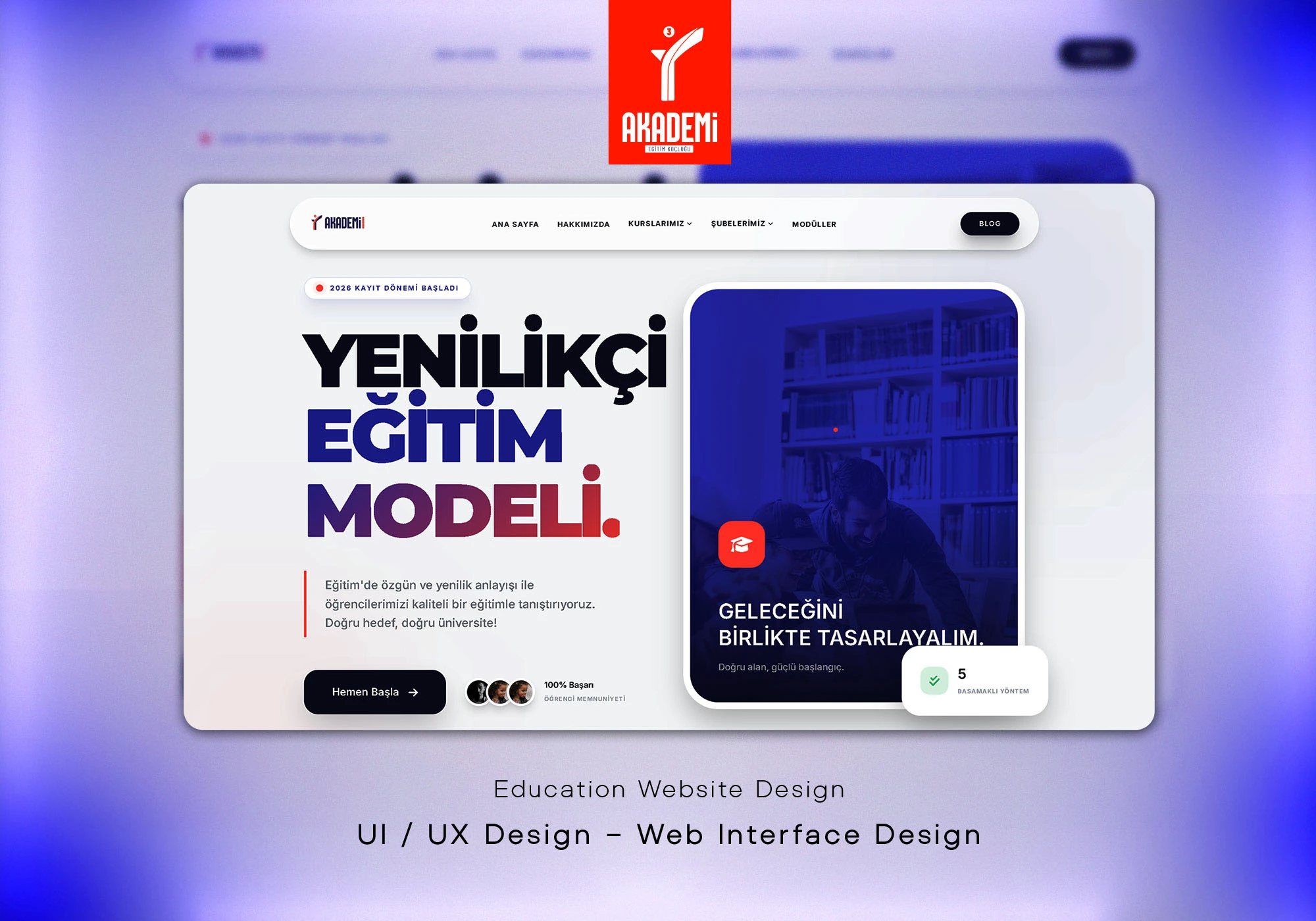
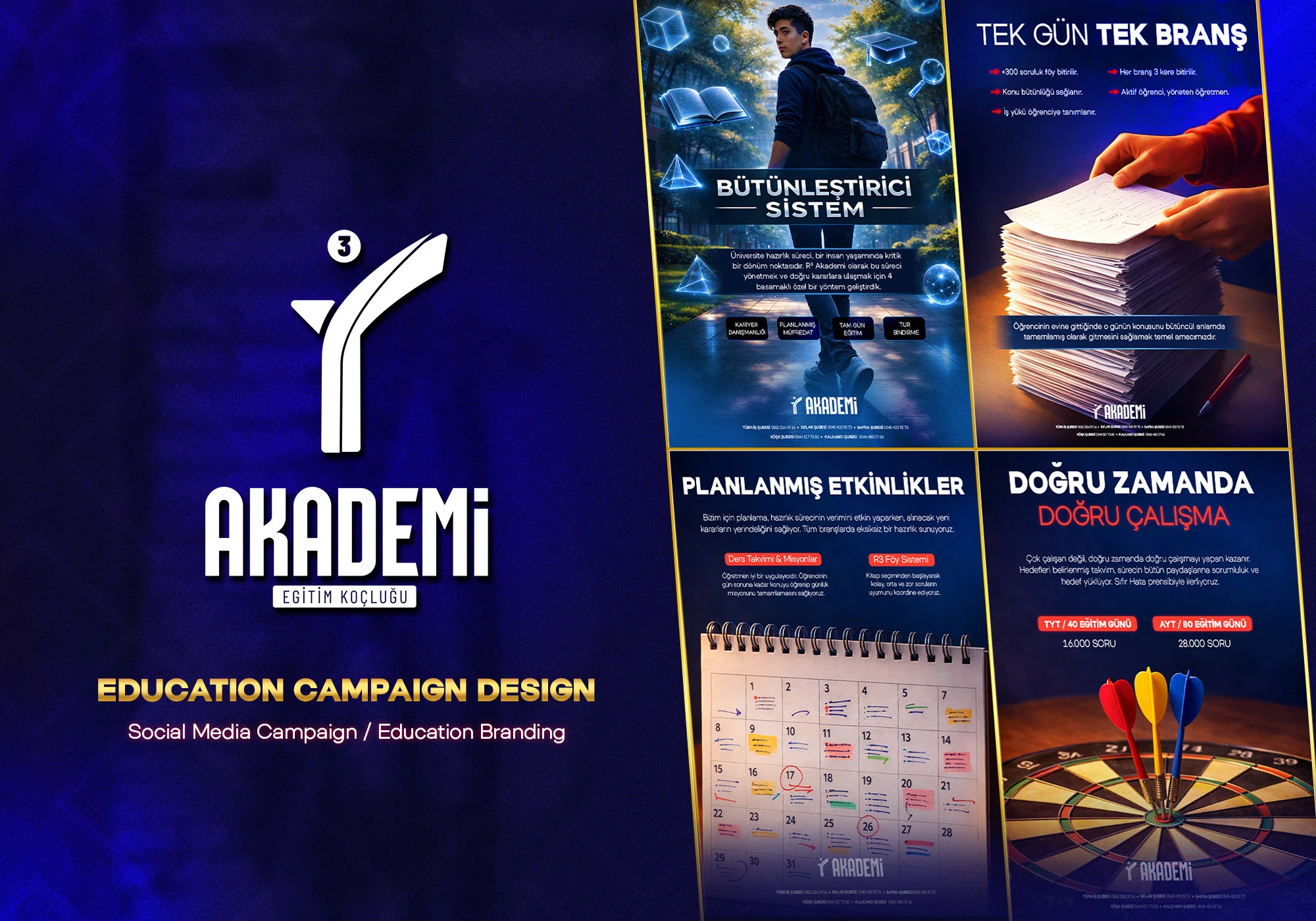
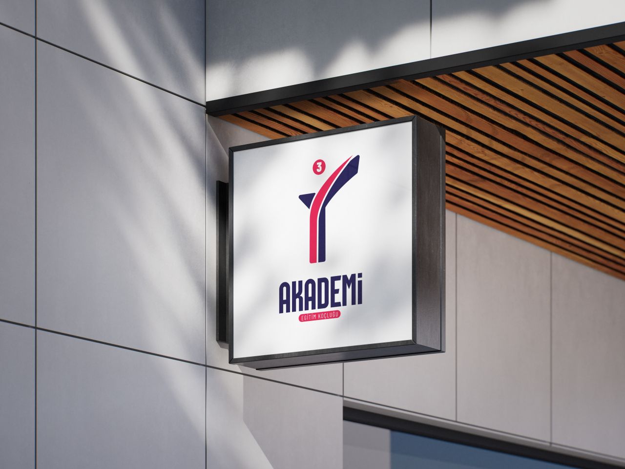
I am a designer specializing in corporate identity, brand strategy, and digital design. I approach design not just as a visual outcome, but as a strategic tool that strengthens brand positioning.

My goal is to help brands achieve a clear, strong, and internationally competitive visual language. In every project, I focus on creating high-quality solutions that deliver long-term value.

Works
Hüseyin Karataş
5+ Works
Scroll Down

My Works

Projects I've completed with institutions

High Graphic
View Project
UI/UX - Mobile
High Graphic

Finpro is a modern mobile application designed to help users manage their financial processes in a simple and efficient way. With tools for income-expense tracking, budgeting, and financial analysis, it enables users to make smarter financial decisions. Its user-friendly interface and robust infrastructure provide a fast, secure, and seamless experience for both individual and professional users.

R3 Academy
View Project
UI/UX - Web
R3 Academy

This web interface design for R3 Akademi was created to transform the university preparation journey into a more structured, clear, and motivating experience. With a user-centered UI/UX approach, complex educational processes are simplified and content hierarchy is carefully organized. The modern design language, strong typography, and dynamic color gradients highlight the brand’s innovative and disciplined identity. Additionally, intuitive navigation and clear call-to-actions enhance user engagement and overall interaction quality.

R3 Academy
View Project
Socail Media
R3 Academy

This project was created for R3 Academy, an education institution focused on university preparation programs. The campaign highlights a structured learning system and communicates motivation, planning, and discipline through cinematic visuals and modern typography.

R³ Academy
View Project
Design
R³ Academy

For R³ Akademi, the goal was to create a clear and reliable visual identity that reflects guidance, direction, and conscious decision-making in education. The logo is built around the idea of progression and choice, translated into a simple and functional mark that works consistently across physical and digital environments. Rather than focusing on decorative details, the design prioritizes clarity, balance, and long-term usability within a broader brand system. This project was approached as a visual identity system, not just a standalone logo.

NEXORA
View Project
Logo Design
NEXORA

Built around the ideas of clarity, flow, and forward movement. The symbol focuses on connection and direction, while the typography reinforces a clean, confident, and modern identity. Designed to communicate simplicity and structure across digital workflows.

Institutions I've Worked With

Brands and organizations I've collaborated with

Contact

Contact

Location Samsun, Turkey